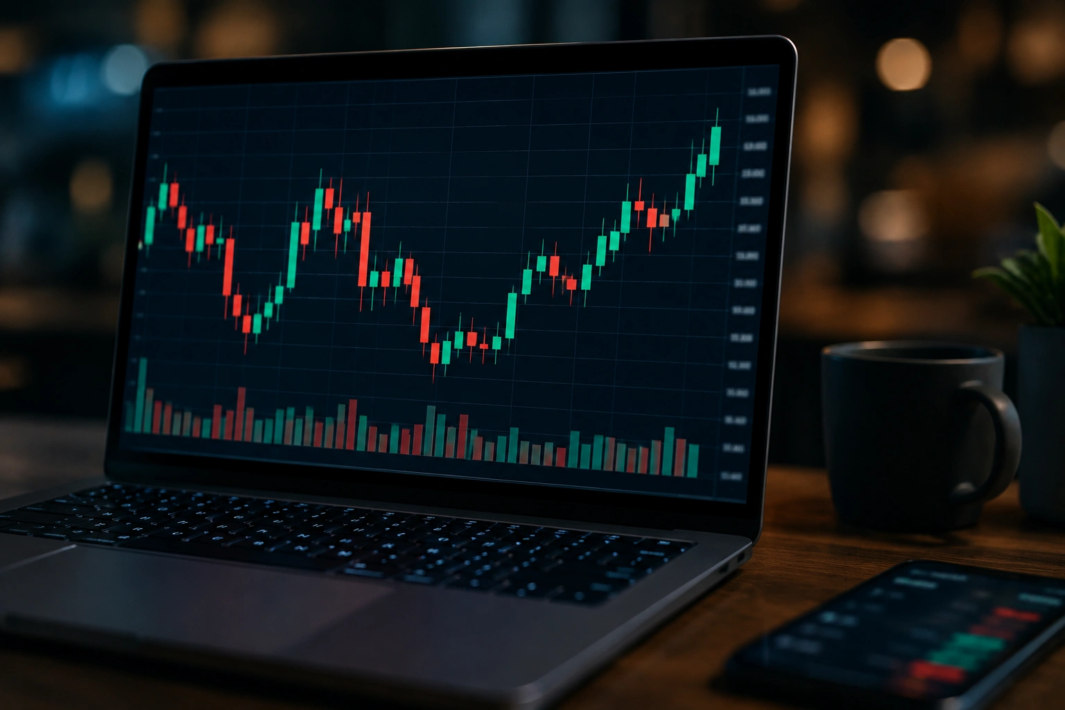
A candlestick chart is one of the most popular ways to display price movements in financial markets. Traders use it to study stocks, cryptocurrencies, forex, commodities, and other assets. Unlike a simple line chart, a candlestick shows important information about price activity during a specific period, including the opening price, closing price, highest price, and lowest price.
Each candle tells a small story about buyers and sellers during that period. By learning how to read these four price points, beginners can understand market movement more clearly. Candlestick charts can also help identify trends, possible reversals, and changes in buying or selling pressure. However, individual patterns should not be treated as guaranteed signals.
What Is a Candlestick Chart?
A candlestick chart is a visual representation of price movement over a selected period. Each candle represents one time interval, such as one minute, one hour, one day, or one week. The four main prices shown are the open, high, low, and close, often called OHLC data. Together, these values provide a quick view of what happened to an asset during that period.
The main body of a candle shows the distance between the opening and closing prices. Thin lines extending above or below the body are called wicks or shadows and show the highest and lowest prices reached. This makes a candlestick chart more informative than a basic line chart because traders can see not only where the price ended but also how much it moved during the period.
How to Read a Candlestick
Reading a candlestick starts with understanding its body and wicks. If the closing price is above the opening price, the candle is generally considered bullish. If the closing price is below the opening price, it is generally bearish. Charting platforms often use different colors to distinguish the two, although the exact colors can vary.
The length of the candle also provides useful information. A long body can indicate strong price movement during that period, while a small body may suggest limited movement or uncertainty. A long upper wick can show that prices moved higher but later fell back, while a long lower wick can indicate that sellers pushed prices down before buyers recovered some of the decline.
The Four Key Prices
Every standard candlestick contains four important pieces of price information:
- Open: The price at the beginning of the selected period.
- High: The highest price reached during that period.
- Low: The lowest price reached during that period.
- Close: The price at the end of the period.
Understanding these four values is the foundation of reading price action. Once you know what they represent, you can begin recognizing common formations and comparing candles with surrounding market activity.
Bullish and Bearish Candles
A bullish candle forms when an asset closes higher than it opened. It suggests that buyers had greater control over that particular period. A strong bullish candle with a relatively large body can show substantial upward momentum, especially when it appears alongside increased trading activity. For more: How Much Is One Gold Bar Worth? Gold Bar Value Guide
A bearish candle forms when the closing price is lower than the opening price. This indicates that sellers controlled more of the period’s price movement. However, one bearish candle does not automatically mean that a market will continue falling. Its meaning depends on where it appears within the broader trend and how subsequent candles behave.
Common Candlestick Patterns
Traders study several common candlestick patterns to understand potential changes in market sentiment. Examples include the doji, hammer, shooting star, engulfing pattern, and morning or evening star. Each formation describes a particular relationship between the candle’s body, wicks, and nearby candles.
For example, a doji has a very small body because the opening and closing prices are close together. It can suggest indecision between buyers and sellers. A hammer has a small body with a relatively long lower wick and may indicate that selling pressure was rejected. These patterns are more useful when considered alongside trend, support, resistance, and volume rather than in isolation.
Why Context Matters
A candlestick pattern does not have exactly the same meaning in every situation. A hammer appearing after a prolonged decline may attract more attention than the same shape appearing randomly in a sideways market. Location and surrounding price action can significantly change how traders interpret a formation.
For this reason, experienced traders generally combine candlestick analysis with other methods. A related support and resistance guide can help explain why certain price levels matter, while a technical analysis guide can provide additional context for understanding market structure and momentum.
Candlestick Charts and Market Trends
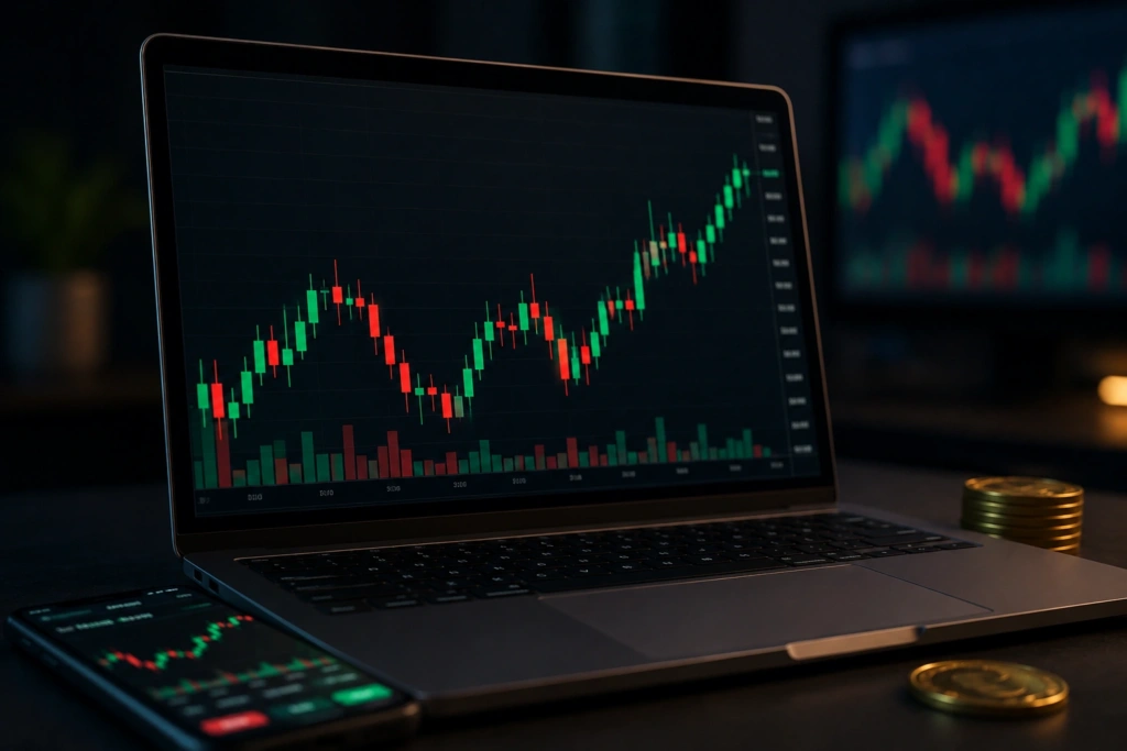
Candlestick charts are particularly useful for identifying trends. A series of higher highs and higher lows can indicate an upward trend, while lower highs and lower lows may point toward a downward trend. Candles help traders see these changes because they display detailed price movement rather than only closing prices.
During a strong trend, individual candles can also show changes in momentum. For instance, a series of large bullish candles may indicate strong buying pressure, while increasingly small candles near a resistance level could suggest that momentum is weakening. These observations do not predict what will happen next, but they can help traders evaluate the current market structure.
Using Candlestick Charts With Volume
Volume measures how much of an asset is traded during a particular period. Combining volume with a candlestick chart can provide additional information about the strength behind a price movement. A large price move accompanied by high volume may receive more attention than a similar move occurring on unusually low volume.
For example, if an asset breaks above a resistance level with a strong bullish candle and significantly higher volume, traders may view the move as more meaningful. However, volume interpretation varies between markets and assets. It is therefore better to use it as supporting evidence rather than as a standalone prediction tool.
Candlestick Chart Time Frames
The same market can look very different depending on the selected time frame. A one-minute candlestick chart shows short-term movements, while a daily chart summarizes an entire trading day in each candle. Longer time frames generally provide a broader view of market structure.
Short-term traders may focus on intraday charts, while investors often pay more attention to daily or weekly candles. Looking at multiple time frames can provide additional context. A short-term bullish pattern, for example, may occur while the longer-term market remains in a downward trend.
Advantages and Limitations of Candlestick Charts
A major advantage of candlestick charts is the amount of information they provide in a compact visual format. Traders can quickly see opening and closing prices, intraperiod highs and lows, momentum, and possible changes in sentiment. This makes candlesticks useful for both short-term technical analysis and longer-term market research.
However, candlesticks have limitations. A pattern cannot guarantee a future price movement, and the same formation can produce different outcomes depending on market conditions. False signals can occur frequently, especially in volatile or low-volume markets. Traders should therefore avoid making decisions based on one candle alone and should consider risk management and broader market information.
How Beginners Can Use Candlestick Charts
Beginners should first focus on understanding basic candles rather than memorizing dozens of complicated patterns. Learn the difference between bullish and bearish candles, identify the open, high, low, and close, and understand what body and wick lengths represent. Once these basics become familiar, studying common patterns becomes much easier.
It is also useful to practice with historical charts before risking real money. Look at how different formations behaved in various market conditions and compare them with trend direction, support, resistance, and volume. A beginner’s technical trading guide can also provide useful background. Most importantly, treat candlestick analysis as a tool for evaluating probabilities rather than a method for predicting markets with certainty.
Frequently Asked Questions
What is a candlestick chart used for?
A candlestick chart is used to display price movements and study market behavior. Traders use it to analyze trends, momentum, support, resistance, and potential price reversals.
What do the wicks on a candlestick mean?
The wicks show the highest and lowest prices reached during the selected period. A long wick can indicate that the market rejected prices at a particular level.
Is a candlestick chart better than a line chart?
It depends on the user’s purpose. Candlesticks provide more information about price movement, while line charts offer a simpler view that often focuses mainly on closing prices.
Which candlestick pattern is best for beginners?
Beginners can start with simple formations such as dojis, hammers, engulfing candles, and shooting stars. Their meaning should always be considered within the broader market context.
Can candlestick charts predict market prices?
No chart pattern can reliably guarantee future price movements. Candlesticks can help traders evaluate market behavior and possible scenarios, but uncertainty and risk always remain.
Conclusion
A candlestick chart provides a detailed yet easy-to-read picture of price movement. By showing the open, high, low, and close, each candle helps traders understand the balance between buyers and sellers during a specific period. Common patterns can provide useful clues about momentum and possible market changes.
For beginners, the best approach is to learn the fundamentals, practice reading real charts, and combine candlestick signals with trend, volume, and support and resistance analysis. Used carefully, candlestick charts can become a valuable part of a broader technical analysis strategy.