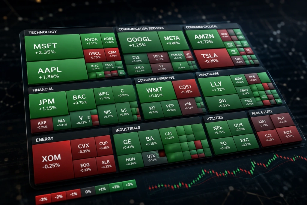
A stock heat map is a visual tool that helps investors understand how stocks and sectors are performing at a glance. Instead of studying long tables of prices and percentage changes, you can quickly see market movements through different colors, sizes, and groupings. Green areas usually represent gains, while red areas indicate losses, making it easier to identify strong and weak parts of the market.
Stock heat maps are useful for beginners and experienced investors because they turn large amounts of market data into an easy visual picture. They can show individual companies, industries, sectors, market indexes, or entire markets. However, a heat map should be treated as a research tool rather than a complete investment strategy. Understanding what the colors and sizes mean is essential before using the information to make decisions.
What Is a Stock Heat Map?
A stock heat map is a visual representation of stock market data where individual companies are displayed as colored blocks. The color normally shows whether a stock has gained or lost value during a selected period, while the size of each block can represent market capitalization or another measurement. This design allows investors to compare many securities without reading hundreds of separate figures.
For example, a large green block may represent a major company that has risen significantly during the trading session. A smaller red block could represent a smaller company that has declined. When several large blocks in the same sector are green, the heat map can reveal broad strength within that industry. This makes a stock heat map particularly useful for quickly identifying market trends before moving to more detailed research, such as reading company financials or checking an earnings report.
How Does a Stock Heat Map Work?
Most stock heat maps organize companies according to sectors, industries, indexes, or market capitalization. Each company appears as a rectangle, and the rectangle’s size usually reflects the company’s relative importance in the selected group. The color then communicates performance, often using a scale from deep red for larger losses to bright green for stronger gains.
The exact design can vary between financial platforms, so investors should always check the legend and settings before interpreting the chart. Some heat maps show daily percentage changes, while others may display weekly, monthly, or yearly performance. A map might also use trading volume, valuation, or another metric instead of price movement. Understanding the selected time period and measurement prevents misleading conclusions and makes the visual data much more useful.
How to Read a Stock Heat Map
Reading a stock heat map is relatively simple once you understand its basic elements. Start by checking the time period, then look at the color scale to determine whether the displayed stocks are rising or falling. Next, examine the size of each block. Large blocks often represent companies with greater market capitalization, meaning their movements may have a larger effect on a major market index.
After identifying the strongest and weakest areas, look for patterns rather than focusing on one company. If most technology stocks are green while financial stocks are red, the map may suggest that technology is outperforming financial companies during that period. However, this does not automatically mean technology stocks are better investments. A heat map shows what is happening in the market, but it does not explain every reason behind the movement.
Why Investors Use Stock Heat Maps
One major advantage of a stock heat map is speed. Financial markets contain thousands of listed companies, and reviewing each stock individually would take considerable time. A visual market overview allows investors to scan performance within seconds and decide which sectors or companies deserve closer attention. This can make daily market research more organized and efficient. For more: Gold Price Prediction: What Could Happen Next?
Heat maps can also help investors notice relationships that may be difficult to see in a traditional price table. For instance, several companies in the same industry may move in the same direction because of interest-rate expectations, commodity prices, economic news, or industry-specific developments. Investors can use these patterns as a starting point for further research. A useful internal resource such as a guide to stock market sectors can provide additional background when a particular industry begins showing unusual strength or weakness.
Stock Heat Map and Market Sectors
Sector analysis is one of the most practical uses of a stock heat map. Common market sectors include technology, healthcare, financial services, energy, consumer goods, industrials, utilities, and real estate. When companies are grouped by sector, investors can quickly see where buying or selling pressure appears to be concentrated.
Imagine that energy companies are mostly green after a sharp increase in oil prices, while transportation companies are mostly red. The heat map provides an immediate visual clue that energy-related stocks may be benefiting from the change while transportation businesses could face higher costs. Investors can then investigate the underlying news, company results, and economic conditions. For a broader comparison, readers may also explore how sector performance affects stock prices before drawing conclusions from a single trading session.
Stock Heat Map for Beginners
For beginners, a stock heat map can make market information less intimidating. Instead of trying to understand a long list of ticker symbols and percentage changes, new investors can first observe the overall pattern. Large green and red sections provide a quick impression of market sentiment, while sector groupings show which areas are attracting attention.
However, beginners should avoid treating color as a simple buy or sell signal. A stock that is bright green may already have experienced a large price increase, while a red stock may be falling because of a temporary event or a serious fundamental problem. Before investing, beginners should combine heat map information with company research, valuation measures, financial statements, and risk assessment. A helpful beginner’s stock investing guide can explain these additional steps and provide a stronger foundation for making informed decisions.
Using a Stock Heat Map for Market Research
A stock heat map works best as the first stage of a broader research process. An investor can begin by checking the overall market, identify unusually strong or weak sectors, and then narrow the research to individual companies. From there, the investor can examine price charts, earnings results, revenue growth, debt levels, valuation, and recent company announcements.
The tool can also be useful when reviewing a portfolio. Suppose a portfolio contains several technology companies, but the heat map shows that technology is significantly weaker than other sectors. That observation may encourage the investor to review how much exposure the portfolio has to one industry. It does not necessarily mean the holdings should be sold. Instead, the heat map highlights an area that may deserve closer attention and encourages a more structured portfolio review.
Stock Heat Map vs. Traditional Stock Tables
A traditional stock table provides precise information such as the current price, percentage change, trading volume, market capitalization, and other figures. This format is excellent when an investor needs exact numbers. A heat map, by comparison, emphasizes visual comparison and patterns. It can show dozens or hundreds of securities in a compact format, making it easier to see the bigger picture.
Neither method completely replaces the other. A practical research process often starts with the heat map and moves to a stock table for detailed analysis. For example, an investor might notice that several semiconductor companies are performing strongly on the map. The next step could be checking individual stock prices, valuation ratios, earnings expectations, and trading volume. This combination provides both visual context and numerical detail without depending too heavily on either method.
Benefits and Limitations of Stock Heat Maps
A stock heat map has several useful features for market analysis:
- Fast market overview: It summarizes many stocks in one visual display.
- Easy sector comparison: Investors can quickly compare different industries.
- Pattern recognition: Similar movements among related companies become easier to notice.
- Market-cap visibility: Larger companies can be visually distinguished from smaller ones.
- Research efficiency: It helps investors decide where to investigate further.
Despite these benefits, a heat map has limitations. It does not explain why a stock moved, whether its valuation is attractive, or whether the movement is likely to continue. Colors can also encourage emotional reactions, especially during periods of heavy market volatility. A professional approach is to use the heat map to generate research ideas and then verify those ideas with reliable financial information. This helps separate useful market signals from short-term noise.
How to Use a Stock Heat Map Effectively
Start by selecting an appropriate market and time period. If you are reviewing today’s trading session, make sure you understand that the displayed performance may change throughout the day. Then identify the broad market direction before examining individual sectors. This prevents a single eye-catching stock from distracting you from the wider market environment.
Next, move from broad observations to detailed research. Identify sectors with unusual performance, select companies that appear interesting, and investigate the reasons behind their movement. Check company announcements, earnings reports, valuation data, and relevant economic developments. Investors can also combine the heat map with stock charts and technical indicators when appropriate. The goal is not to predict the market from colors alone but to use the visual information as an efficient starting point for deeper analysis.
Stock Heat Maps and Real-Life Market Analysis
Consider a simple example in which a stock heat map shows most technology companies in green while banks and consumer companies are mostly red. An investor might initially conclude that technology is leading the market. However, that observation is only the beginning. The investor should then examine whether the movement is connected to interest-rate expectations, company earnings, economic data, or a major industry announcement.
Another example could occur during a broad market decline. If almost every sector appears red, the map may indicate that selling pressure is widespread rather than limited to one industry. If defensive sectors remain relatively strong while growth sectors fall sharply, the pattern may provide additional context about investor behavior. These examples show why the heat map is valuable: it helps investors ask better questions. The answers still require careful research and reliable financial evidence.
Common Mistakes When Using a Stock Heat Map
One common mistake is assuming that the biggest green block is automatically the best investment opportunity. Large companies can move for many reasons, and strong recent performance does not guarantee future gains. Another mistake is ignoring the time frame. A stock may be down today but still have strong long-term performance, or it may be up today despite serious longer-term weaknesses.
Another problem is relying on the visual chart without checking the underlying data. Heat maps simplify information, which is their main strength, but simplification can also hide important details. Investors should check whether the map measures price performance, total return, volume, market capitalization, or another metric. It is also important to consider dividends, corporate actions, currency effects, and trading hours when comparing securities. Careful interpretation makes the tool more reliable and reduces the risk of making decisions based solely on appearance.
Frequently Asked Questions
What is a stock heat map used for?
A stock heat map is used to quickly compare stock and sector performance through colors, sizes, and visual groupings.
What do green and red mean on a stock heat map?
Green usually represents price gains, while red generally represents losses. The exact color scale depends on the platform.
Does a stock heat map show market capitalization?
Many heat maps use market capitalization to determine the size of each company block, but the method can vary by platform.
Can beginners use a stock heat map?
Yes. It is a simple way for beginners to understand market patterns, but investment decisions should include additional research.
Is a stock heat map enough to choose stocks?
No. It is mainly a market research tool and should be combined with financial, valuation, and company-specific analysis.
Conclusion
A stock heat map provides a fast and visual way to understand what is happening across stocks, industries, and market sectors. By combining color, size, and organization, it turns complex market information into a format that is easy to scan. Investors can use it to identify strong sectors, notice unusual movements, compare companies, and decide where deeper research may be useful.
The most effective approach is to treat a heat map as a starting point rather than a standalone investment signal. Check the time frame, understand the legend, investigate the reasons behind major movements, and confirm observations with reliable financial information. Whether you are new to investing or regularly follow the markets, learning to read a stock heat map can make market research faster, clearer, and more organized.